Endcap Display Design That Converts Casual Browsers into Buyers
Learn how to design end cap displays that attract attention and use cardboard structures to improve cost, sustainability, and in store execution.
Back to blogs
Endcap displays are located at the end of supermarket or store shelves, right where customers turn. This is truly a prime merchandising spot. Customers don’t have to go out of their way to find them, as the displays are already in their path. With good structural and visual design, endcaps can turn casual browsers into actual buyers in just a few seconds.
For brands and retailers, the goal is clear. Use endcaps to showcase products, reinforce promotional messages, speed up inventory turnover, and do so without overwhelming customers.
Based on the fundamental role of endcap displays, this article elaborates on how to optimize structural and visual design, with a particular focus on the advantages of cardboard endcaps in terms of cost, sustainability, and practical implementation.
Understand the Role of the endcap
An endcap is far more than just a space to stack products. It has clear objectives within the in-store environment.
1.Serve as a visual "stopping point" at the end of aisles.
2.Convey a clear story or promotion through concise messaging.
3.Encourage customers to make simple, straightforward purchase decisions on the spot.
Since endcaps directly face the main aisle, many customers will notice the endcap before the regular shelves. This means the endcap shouldn’t just duplicate the shelf display, instead, it should appropriately streamline the product assortment so customers can grasp the key message at a glance.
Before starting any design work, ask yourself three questions:
1.Who is the target customer?
2.What is the core message this endcap needs to convey?
3.What action do we want customers to take within five seconds?
Clearly answering these three questions will provide direction for the overall layout, copywriting, and product selection.
Starting with a Simple Shopping Flow
An effective endcap display typically guides customers through an extremely simple mental journey:
1.Attention is captured
2.Interest is sparked
3.A quick evaluation is made
4.The product is picked up and purchased
Every component of the display structure should support one of these steps.
Attention Phase
This phase hinges on clear block-style structure, distinct color contrast, and prominent top signage. Customers should be able to identify the brand or product category from several meters away.
Interest Phase
Interest is driven by secondary visual elements, concise copy, and clearly visible product benefits. At this point, customers will have either stopped in their tracks or significantly slowed down.
Evaluation Phase
This takes place when customers draw near the display. Shelf labels, product packaging fronts, and small info cards must be easily readable at hand height, enabling customers to quickly confirm specifications, prices, flavors, or models.
Pickup & Purchase Phase
This relies on stable shelves, a comfortable reach, and straightforward pricing. If customers can grab the product effortlessly, without bending over or standing on tiptoes, the chance of a sale rises noticeably.
Establish a Clear Visual Hierarchy
A high-performing endcap display is typically visually streamlined, even though the design process itself may be quite complex. The core of a visual hierarchy lies in determining what customers see first, second, and third.
A common sequence is:
1.Brand or category information
2.Key benefits or promotional messages
3.Actual product display
Brand or category-related information can be placed on the top signage or in a prominent banner space in the middle of the display. Keep the copy to a single sentence that is easily readable in one glance. For example: "Refreshing & Hydrating, the perfect snack for busy commutes or family movie nights."
The main benefit statement should be limited to around 10 English words. When translated into Chinese, it should remain equally concise to avoid long sentences slowing down the reading pace.
Below this message, include product photos, icons, or simple lifestyle images. Incorporate negative space to prevent visual overcrowding. At the product level, the best practice is to let the packaging speak for itself. Ensure cartons or bottles face customers directly, with key labels not obscured by structural components.
Let Structural Dimensions Work for You
Paper endcap displays are fully customizable, and structural design should serve both the products and the customer experience. Focus on these key areas:
Height
Top signage should be within a comfortable line of sight. If it’s too high, the message is easily overlooked; if too low, it competes for space with shelves. In most supermarket settings, a total height close to the top of adjacent regular shelves works well.
Shelf Spacing
Set spacing based on actual product dimensions. Leave enough height for easy restocking, but not so much that each shelf looks sparse. For small-pack items, more shelves with smaller spacing are ideal. For large bottles or big boxes, reduce the number of shelves and increase the depth of each shelf to hold more.
Load-bearing Capacity and Stability
With proper design, corrugated cardboard can support considerable weight. For displays holding heavy products or requiring high inventory, add internal reinforcements or support structures. A wider base and close fit with in-store fixed shelves also help reduce wobbling.
Accessibility
Place featured and best-selling products between knee and chest height—the golden reach zone. Lower shelves can hold restock items or bulk packs. Avoid placing the most important products too high or too low.
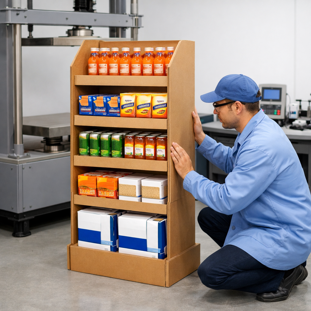
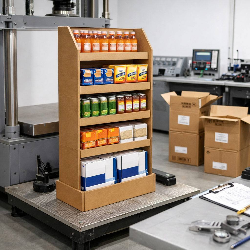
Professional structural design teams typically create prototypes with actual products and conduct simple load-bearing and stability tests before moving to mass production. This ensures a balance between safety and display effectiveness.
Use Graphics and Text Sparingly
Many endcaps underperform because they "say too much." Customers don't read long blocks of text in aisles. They're just quickly scanning for key signals.
Follow these principles for copy and visuals:
1.Stick to one true core message.
2.Use short, specific benefit statements.
3.Limit the number of colors and align them with the brand identity.
4.Ensure sufficient contrast between text and background.
Focus benefit claims on what customers can actually feel rather than internal technology. For example: "Delivers instant refreshment" is easier to understand at a glance than" Features a micro-mineral cooling technology formula." For attributes like sugar-free, recyclable, vegan, or travel-sized, use small icons. Icons are often easier to see from a distance than small text.
When working with a printing and display supplier like Meiya Display, it’s best to prepare high-resolution files with clear layers in advance. Separate the die-cut layer from the graphic layer. This ensures accurate print registration and prevents fold lines from covering key visual elements.
Strategically Plan the Merchandise Assortment
For endcaps to drive real conversions, a clear narrative is essential and so is a strong assortment strategy. Thorough communication between brands, retailers, and display designers is key.
Common approaches include:
- Deep stacking of a single star product: high display density delivers strong visual impact.
- Place one featured product on the most prominent core shelf level, paired with 2-3 complementary flavors or variants.
- Cross-category assortment to meet a complete usage scenario, such as snacks with beverages or shampoo with conditioner.
Whichever approach you choose, avoid overcrowding. If every shelf is filled with products facing different directions, the entire display becomes an extension of regular shelves and loses the effect of a "special display."
Price information also requires unified planning. Use neat price cards or strip labels that align with the in-store system. Larger price numbers can be placed on the base or side panels, but avoid repeating them in too many locations to prevent visual clutter.
Consider Materials, Sustainability, and Logistics
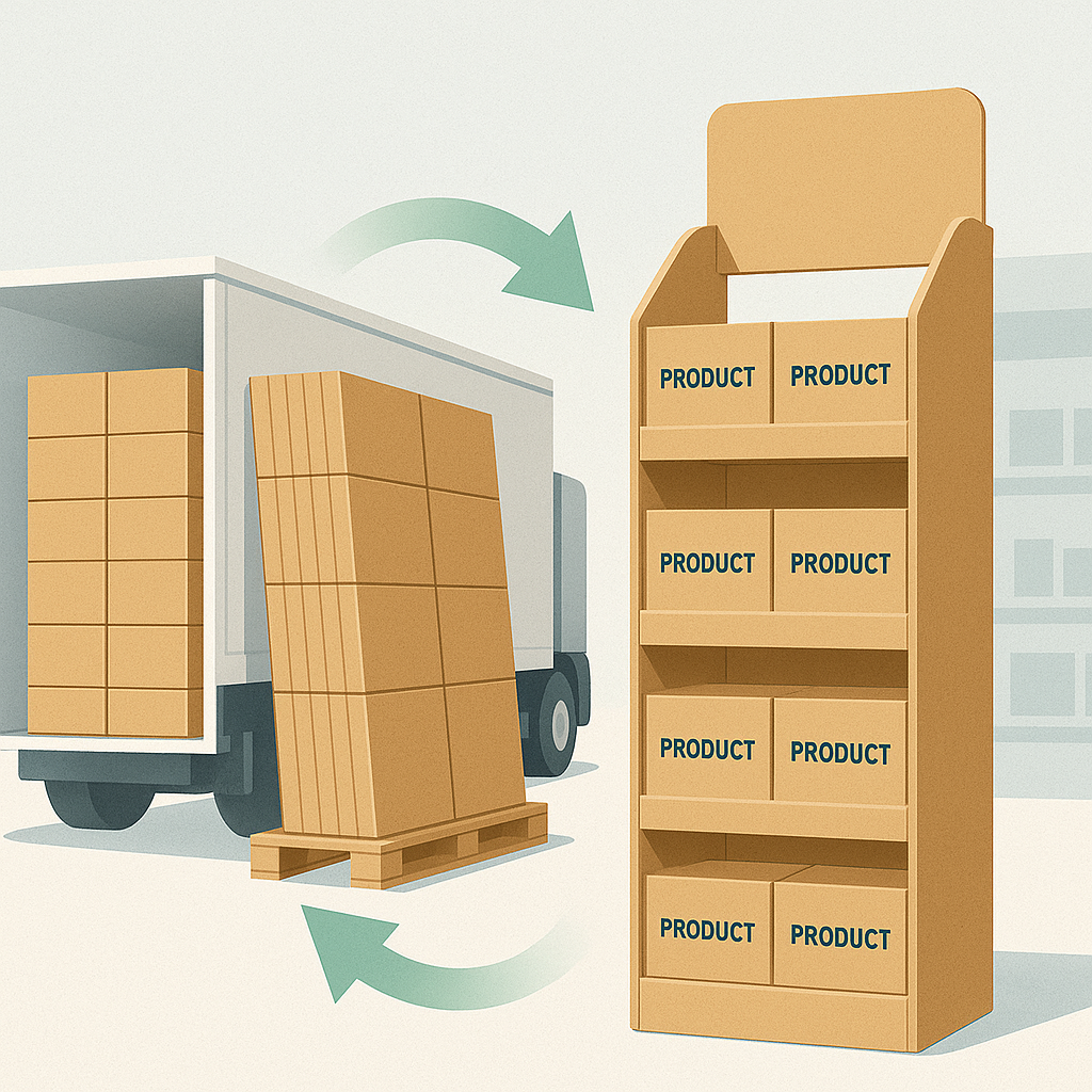
Paper endcaps have gained popularity largely due to being lighter and more recyclable than permanent fixtures. They also enable flat-pack shipping, which reduces logistics and storage costs. When planning the design, it’s advisable to consider the entire product lifecycle.
Material Selection
Choose corrugated cardboard with the appropriate flute type and strength based on product weight and display duration. Pair it with high-quality printing, such as the common four-color printing, plus necessary spot colors to ensure brand color accuracy.
Surface Finishes
For beauty or electronics promotions, glossy lamination makes colors more vivid. In stores with bright lighting, matte lamination reduces glare. You can also use partial varnish or similar techniques to enhance texture in key areas without full-surface application.
Installation Method
Store staff have limited time, so tool-free structures are more acceptable. Designs that can be assembled through simple folding and snap fasteners work best. Including a short, clear installation guide with step-by-step diagrams in the shipping box is a practical choice. Adding a QR code linking to a short video can also help store teams understand the process quickly.
Recycling Phase
Mark recyclability information and material codes on the display’s back panel or an unobtrusive location. This helps stores properly dispose of used displays and strengthens the brand’s sustainability messaging.
Suppliers like Meiya Display strike a balance between visual appeal, structural integrity, and material efficiency. They help clients create professional, reliable solutions without wasting paper.
Align with Store Operations
No matter how strong the design, poor execution will undermine an endcap’s actual performance. Store daily operations should be factored in from the start.
Work with the retailer to confirm the following:
- The exact placement and footprint of the endcap.
- Restocking frequency and responsible personnel.
- Who will maintain front-facing displays and consistent package orientation.
- Whether additional safety measures are needed, such as edge protection or positioning devices.
Structurally, the display can be aligned with surrounding shelves through base size and shape to avoid tripping hazards. Side panels should not extend too far into the aisle to prevent collisions with shopping carts or baskets.
Measure Results and Continuously Optimize
Treat each endcap deployment as a test opportunity. After the promotion, compare sales data from the campaign period with the baseline during regular periods, while collecting visual feedback.
Focus on observing and asking these key questions:
1.Can customers notice the display from a distance?
2.Is the core message easy to grasp at a glance?
3.Which shelf levels have the fastest product movement?
4.Does the structure remain stable and visually appealing throughout the entire display period?
Then make minor adjustments to the next design based on the results. Sometimes slightly adjusting shelf heights, signage proportions, or copy length can lead to measurable conversion improvements.
Summary
A successful endcap display often delivers a seamless, unconscious experience for customers. They see it, understand it, and make a purchase with barely any thought. Behind this experience lies detailed upfront planning, reliable structural engineering, and restrained visual design.
When you start by understanding your target customers, establish a clear visual hierarchy, select materials that balance strength and efficiency, and collaborate closely with the store team, the endcap transforms from a mere shelf extension into a true merchandising tool that converts casual browsers into actual buyers. For many brands, partnering with a paper display specialist like Meiya Display can help streamline the entire process from concept sketch to in-store installation ensuring every endcap lives up to its full potential.
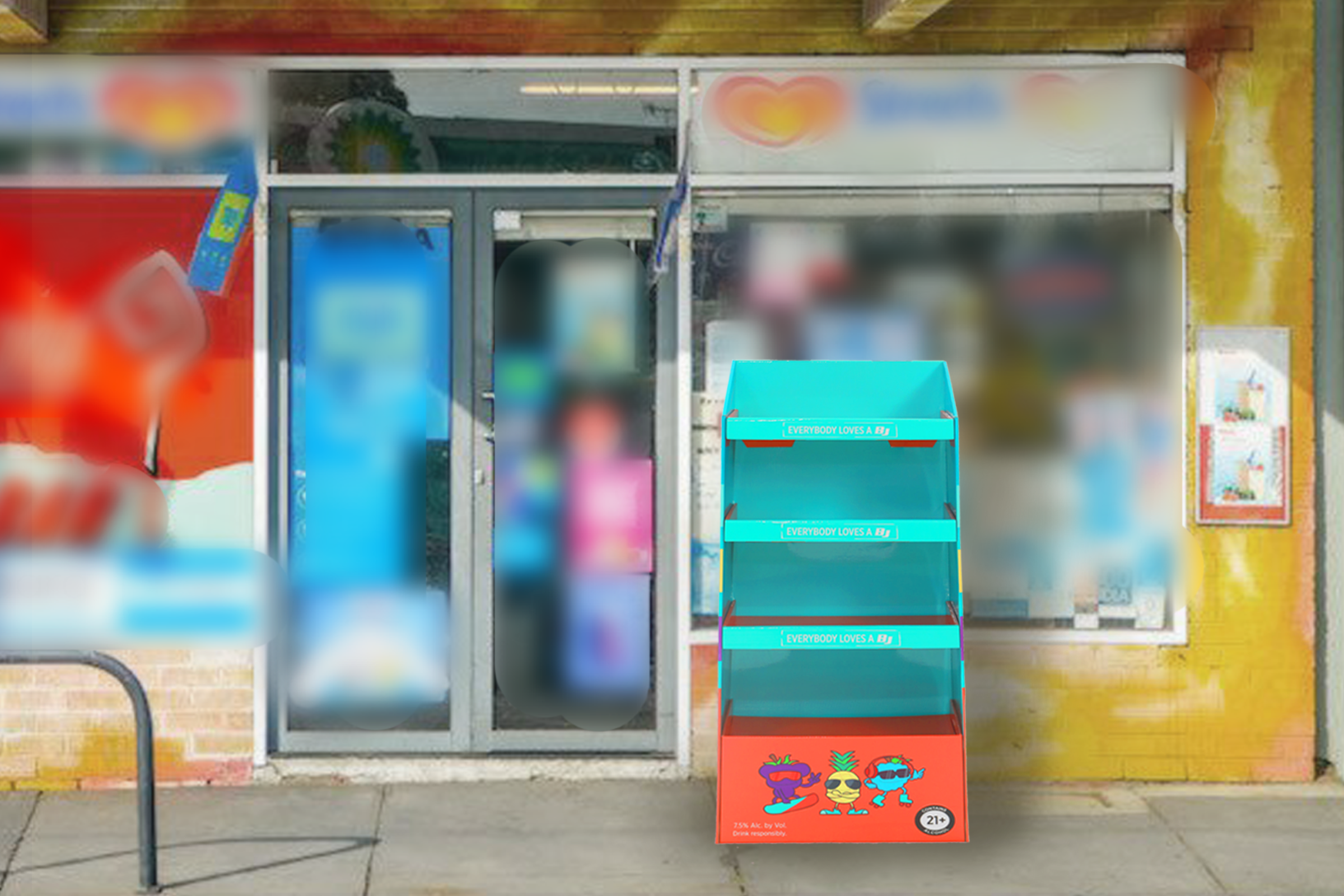
- Cardboard end cap display using color blocking and clear headlines to turn casual aisle traffic into impulse purchases.
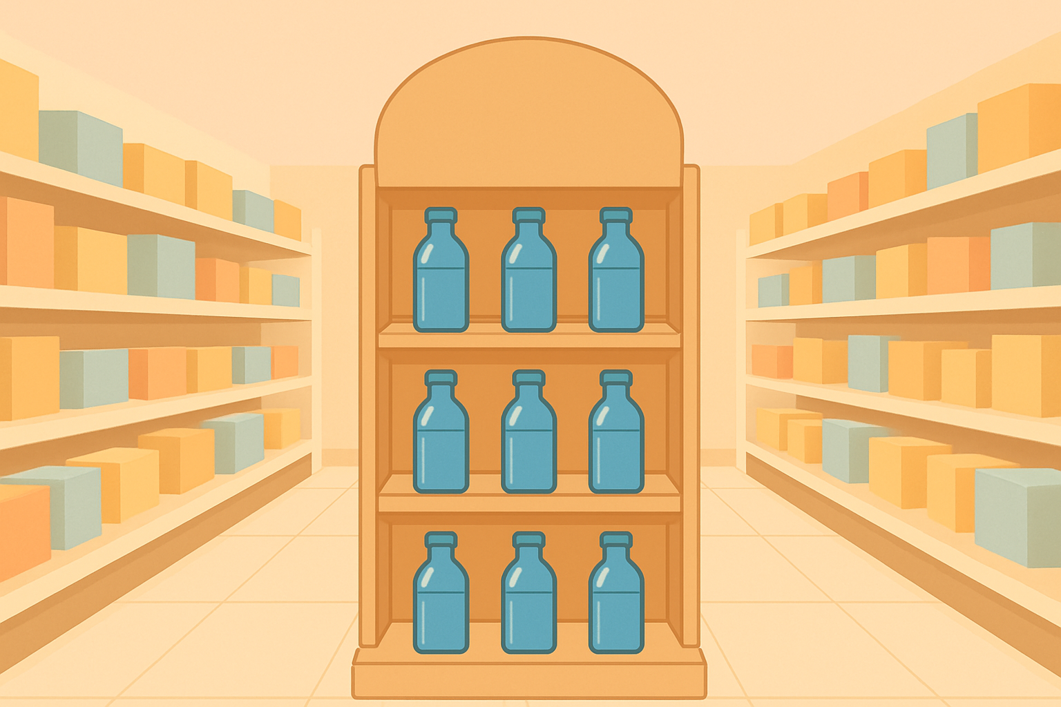
- Sustainable paper end cap display at the end of a supermarket aisle highlighting a seasonal promotion with neatly faced products.
- Branded cardboard end cap display showing how structure and graphics work together to guide shoppers from first glance to purchase.
- Compact paper end cap display demonstrating space efficient merchandising for snacks and beverages in a busy retail aisle.
