How Store Layout Shapes Cardboard Display Placement, Shopper Flow, and Retail Visibility
Store layout shapes how shoppers notice and interact with cardboard displays. Match display placement, size, and structure to the real retail path for better visibility and performance.
Back to blogs
Executive Summary
Store layout directly affects how shoppers see, approach, and interact with cardboard displays. Even a well-designed display can underperform if it sits away from the main traffic path, blocks sightlines, or appears at the wrong stage of the shopping journey.
Grid stores often work well with endcap displays, sidekick displays, and checkout counter displays. Racetrack layouts benefit from planned touchpoints along the shopping loop. Free-flow and boutique stores usually need smaller, lighter displays that support browsing without crowding the space.
For brands, placement should be considered early in the campaign planning stage. Footprint, height, product access, shelf strength, stock capacity, and restocking method should all match the real store environment.
Why Store Layout Matters
A cardboard display is part of the shopper journey, not just a printed holder for products. It needs to attract attention, present products clearly, make picking easy, and support purchase decisions.
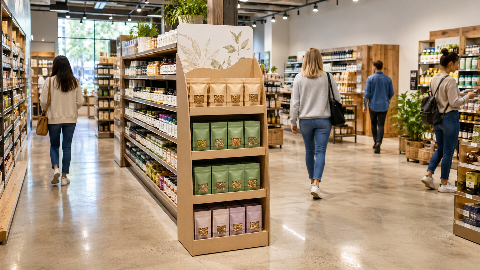
However, the store layout determines whether shoppers notice the display at all. A floor display in a main aisle can gain strong exposure, but it may create friction if the footprint is too large. A countertop display near checkout works well for small impulse items, but not for products that need comparison or explanation. A sidekick display can boost visibility in a grid aisle, yet it should never block regular shelf access.
The best structure isn’t always the largest one. It’s the one that fits the product, the traffic path, and the retailer’s merchandising plan.
Grid Layouts: Use Predictable Decision Points
Grid layouts are common in supermarkets, drugstores, convenience stores, and big-box stores. Shoppers usually follow familiar aisles and move with a clear purpose, so displays work best at predictable decision points.
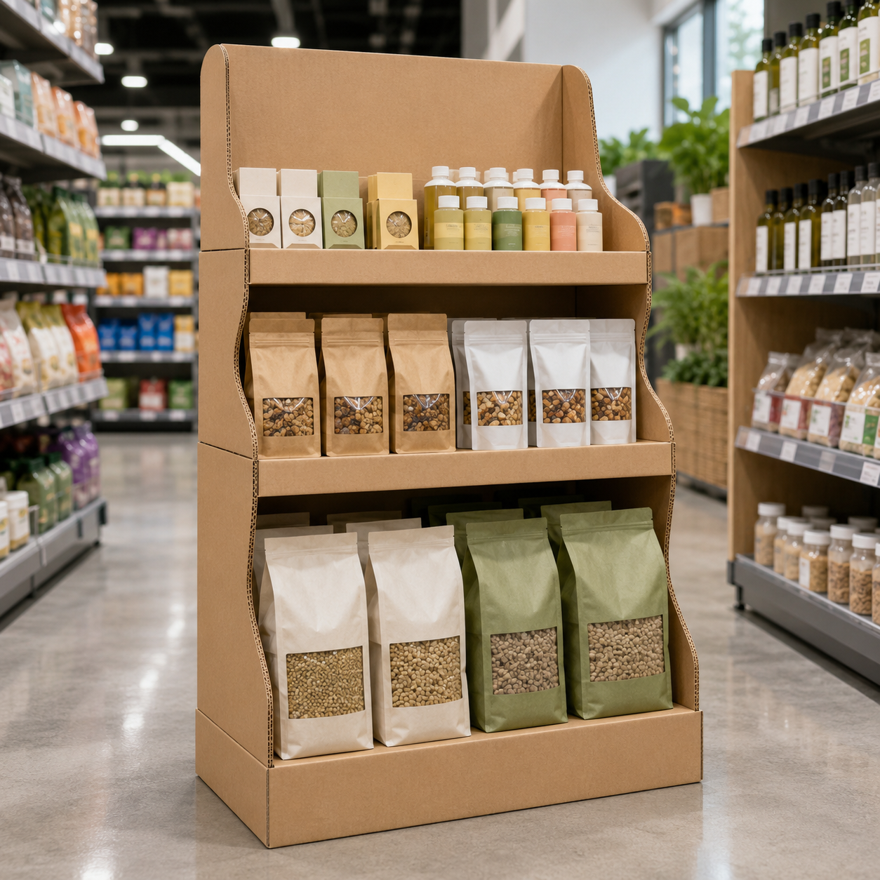
Endcap displays face the main traffic path and suit seasonal campaigns, new product launches, and promotions tied to specific categories. Sidekick displays can be placed near complementary products, such as snacks beside beverages or accessories near electronics. Countertop displays near checkout support quick add-on purchases, including candy, cosmetics, samples, and travel-size products.
The key is balance. The display should stand out without narrowing the aisle. Dividers, front lips, product channels, and reinforced shelves help keep products organized during busy shopping periods.
Racetrack Layouts: Create Planned Display Moments
A racetrack layout, also called a loop layout, guides shoppers along a planned circulation path. In this layout, cardboard displays should be placed as planned touchpoints along the route.
A display near the early shopping path can introduce a campaign. A floor display in the middle of the loop can reinforce the product message. A checkout display can capture final add-on purchases.
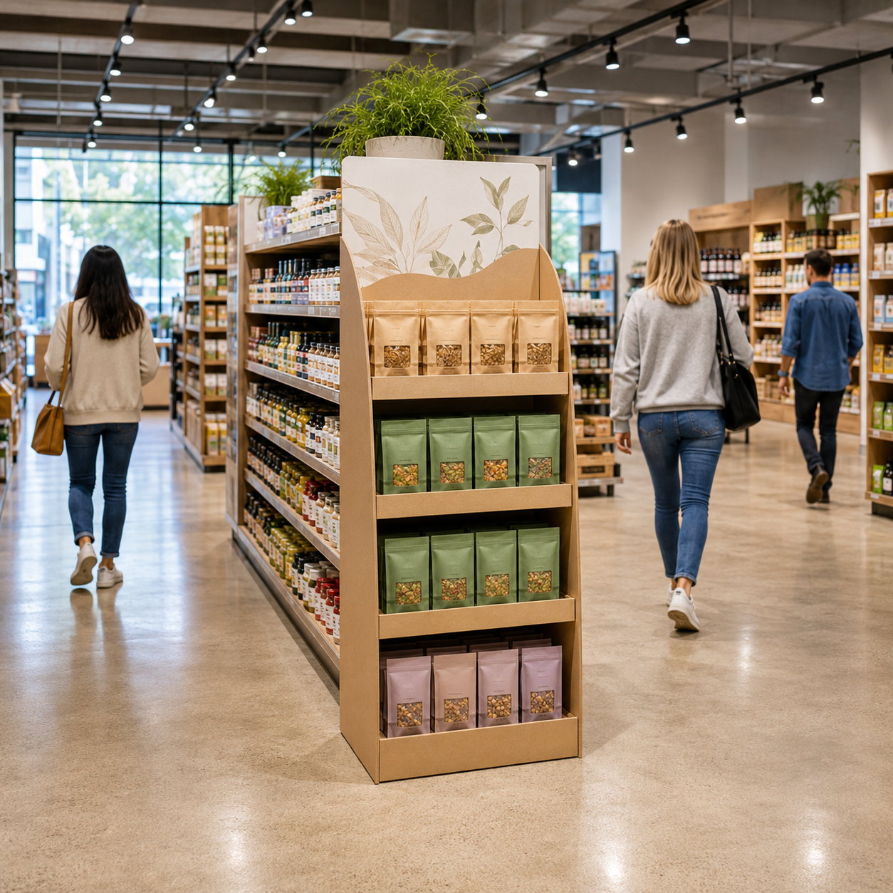
Racetrack layouts suit floor displays, pallet displays, dump bins, and seasonal feature units. Since shoppers move along a guided path, the display should be easy to understand from a distance. Clear product facing, simple graphics, stable bases, reinforced corners, and well-distributed product weight help the unit stay visible, neat, and safe.
Free-Flow and Boutique Layouts: Keep Displays Light
Free-flow layouts are common in fashion, beauty, lifestyle, gift, and specialty stores. Boutique layouts are more curated and often focus on brand story, product style, or lifestyle theme.
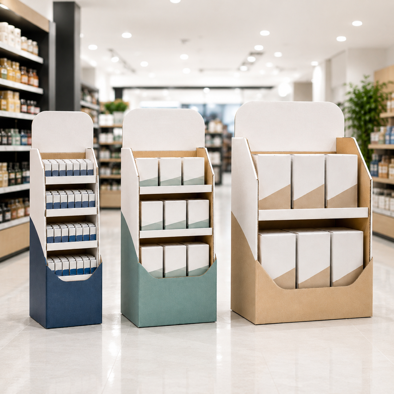
In these spaces, cardboard displays should support browsing rather than interrupt it. Large or bulky floor displays can block sightlines and make the store feel cramped. Compact countertop displays, low floor displays, PDQ trays, and small feature units are often more suitable.
For free-flow stores, the display should guide product discovery without blocking movement. For boutique stores, the display should feel connected to the product story. Printing quality, clean edges, simple graphics, and a structure that matches the product style can all lift the overall impression.
Shopper Flow, Sightlines, and Product Access
A common mistake is placing the most important display right at the store entrance. When shoppers first enter, they need a short moment to adjust and decide where to go. If a display is too close to the entrance, shoppers may pass it before they’re ready to engage.
A better approach is to place key displays slightly beyond the entrance zone, where shoppers have already started following the main traffic path. Sightlines should also be kept clear. Floor displays need to attract attention without blocking category signs, shelf products, staff movement, or other key visual points.
Product access is equally important. Hero products should sit at a naturally visible and reachable height. Heavy products should stay on lower shelves to reduce structural pressure. Small products shouldn’t be hidden behind high front panels. If shoppers have to bend too much or search through messy stock, the display may lose sales even if it looks attractive.
Match Display Type to Store Location
Each cardboard display type works best in a different location. Endcap displays suit high-visibility promotions in grid stores. Sidekick displays are useful when floor space is limited. Countertop displays fit checkout lanes, service desks, and compact product zones. PDQ trays and shelf-ready packaging improve shelf organization and support faster replenishment. Floor displays provide stronger visual impact and higher stock capacity, but they need enough floor clearance and a stable structure. Pallet displays work well in supermarkets, warehouse clubs, and high-volume promotions.
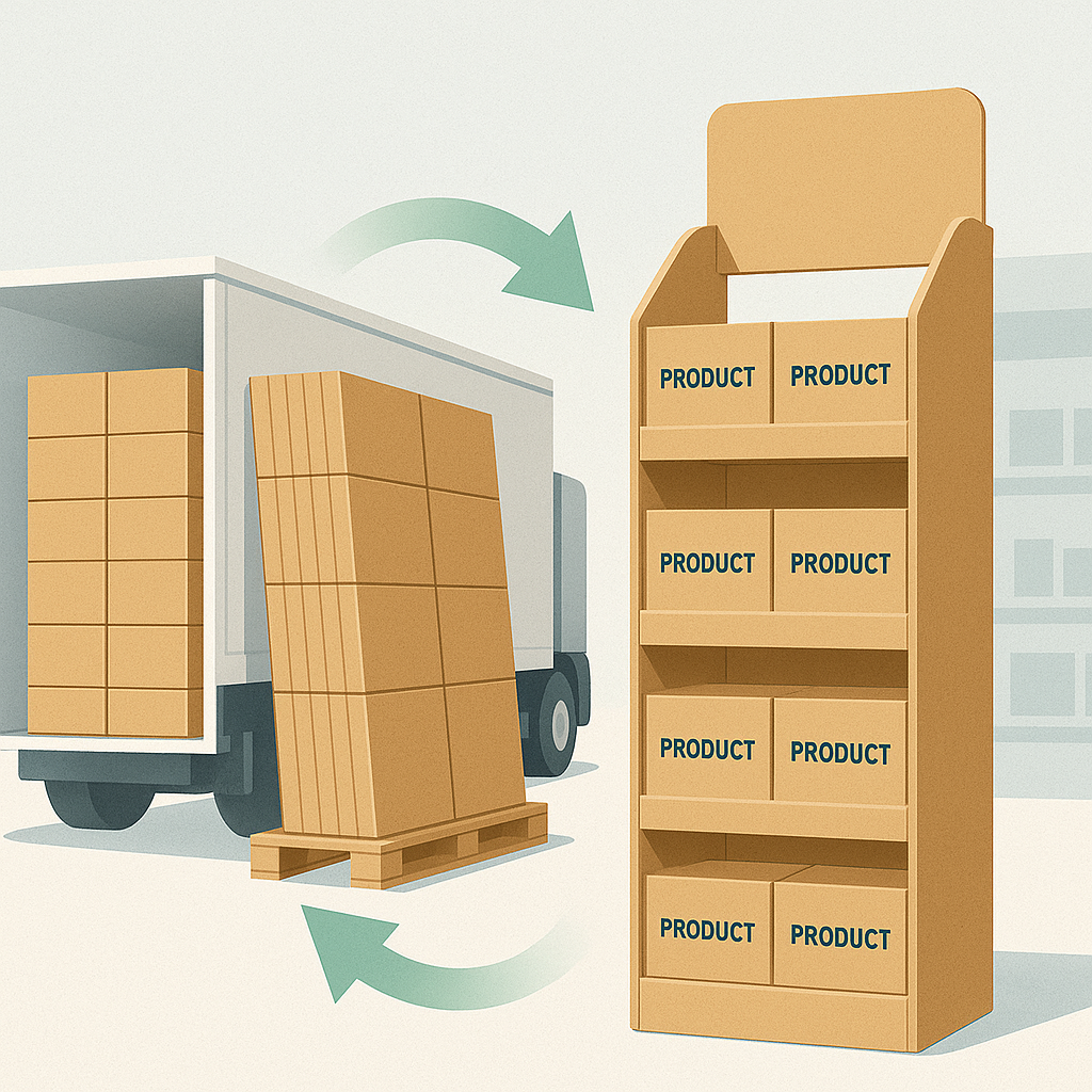
Before production, brands should confirm the store layout, available footprint, aisle width, traffic flow, product weight, shelf load, display height, picking direction, and restocking method. Retailer rules should also be checked early, including display height limits, pallet size, aisle clearance, barcode placement, and setup requirements.
Final Thoughts、
Store layout sh、ould be reviewed before finalizing a cardboard display campaign. The same display can perform very differently in a supermarket aisle, a racetrack store, a convenience shop, a boutique zone, or a checkout area.
Common mistakes include restricting shopper movement, blocking sightlines, crowding the entrance area, using the wrong display format, or focusing only on foot traffic. High traffic doesn’t always mean high conversion. The best location is where the right shoppers are ready to notice, understand, and pick up the product.
When footprint, height, stock capacity, shelf strength, graphics, and restocking method fit the store layout, cardboard displays can guide attention, improve visibility, support smoother shopping, and help retail campaigns perform better in real store environments.
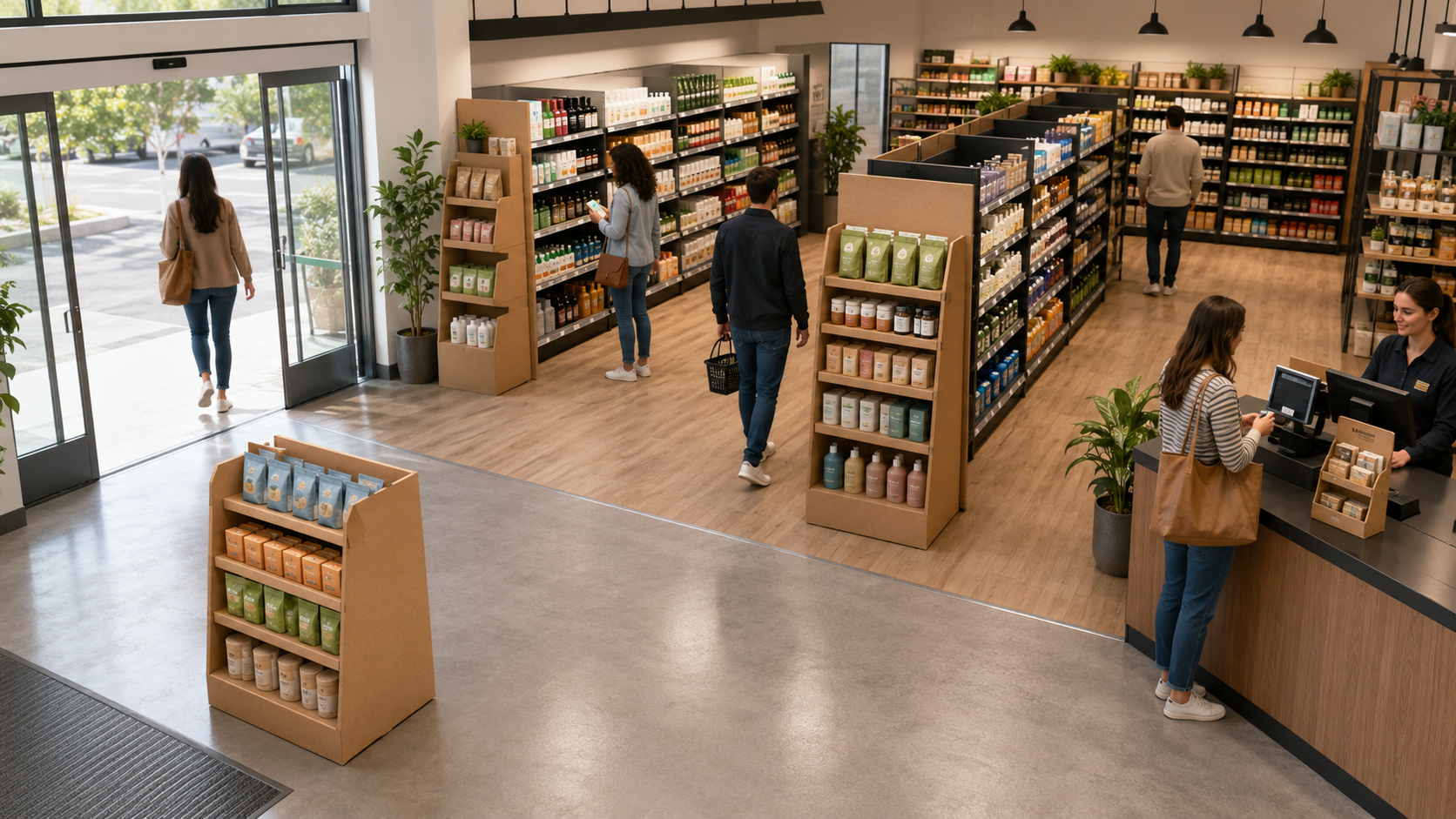
A modern retail store layout showing how cardboard displays can be placed along shopper paths, near aisles, and at checkout to improve product visibility and support smoother in-store browsing.
Useful Links:
Learn how custom cardboard displays can be designed around product size, store layout, campaign goals, and retail placement needs.
A useful example of a floor display designed for strong visibility, product capacity, and retail campaign presentation.
See how compact counter displays can support checkout zones, service counters, and small product promotions.
A practical example of how cardboard display packaging can improve product organization and visibility in compact retail spaces.
Suitable reference for boutique style display presentation, where visual consistency, clean structure, and product storytelling matter.
Latest Posts
All Posts